Problem Statement
A Fintech client needed a dynamic dashboard capable of aggregating data from diverse sources. Additionally, Client emphasized the importance of visually compelling charts depicting Revenue trends, Expenses, and Budget comparisons. Client desired dashboard with aesthetically pleasing view and custom tooltip to enhance the overall user experience.
Solution Overview
Our team designed and delivered an interactive dashboard comprising multiple tabs, each offering valuable insights and visualizations to address the client’s needs.
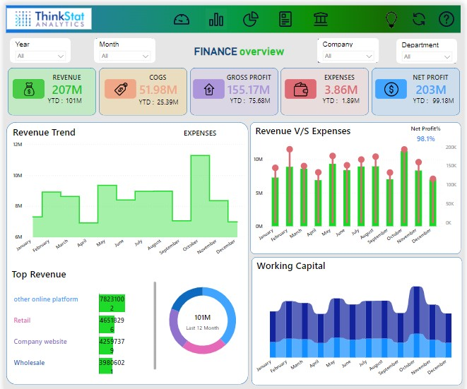
- Financial Overview Tab: It contains visuals illustrating the revenue and expense trends, a comparative chart between current revenue and expenses, insights into top revenue accounts, a depiction of the working capital trend, and card visuals for essential metrics such as revenue, COGS, gross profit, net profit, and expenses. Additionally, last year’s values for each metric provide a meaningful context for performance evaluation
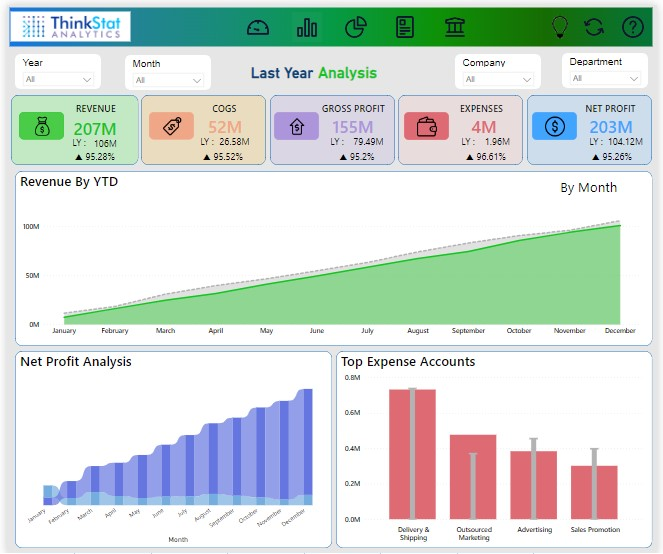
- Last Year Analysis Tab: This tab focuses on a detailed comparison between the current and last year’s financial performance. It includes trend analyses for revenue by month and year, a comparison of top expenses between the current and last year, and a netprofit analysis for both periods.
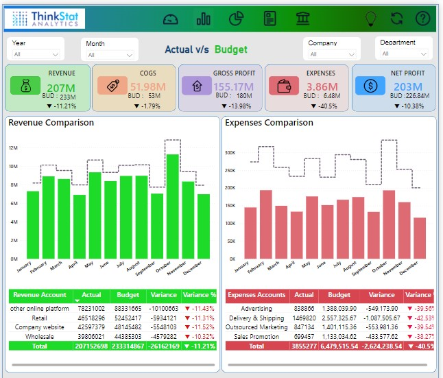
- Actual V/S Budget Tab: In this tab, the emphasis is on comparing actual revenue and expenses against budgeted values. The tab features charts for this comparison, accompanied by card visuals displaying actual and budgeted values for crucial metrics, including Revenue, COGS, net profit, gross profit, and expenses. The inclusion of percentage change metrics further aids in understanding the variance between actual and budgeted figures.
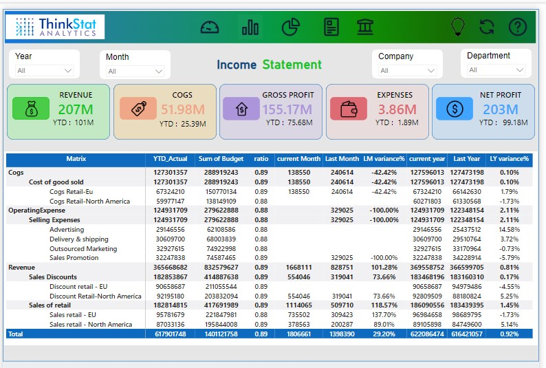
- Income Statement Tab: This tab presents a matrix visual depicting the organization’s income statement. This visual is complemented by additional card visuals that offer concise insights into various aspects of the income statement.
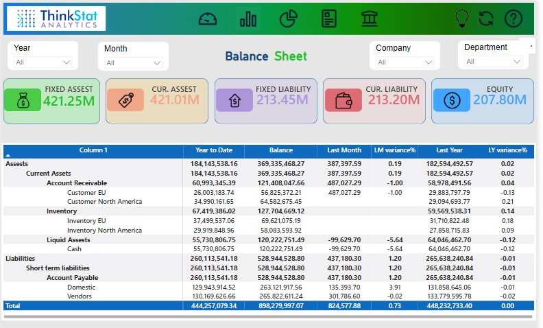
- Balance Sheet Tab: It features a matrix visual providing a comprehensive overview of the organization’s income and expenses. This visual representation is instrumental in understanding the financial health of the organization, showcasing the interplay between income and expenses to maintain a balance.
Tech Stack leveraged
For collecting the data, the client’s SQL database and Smartsheet were used. The preprocessing phase involves the use of Power Query, while Power BI is used for visualization.
Benefits Delivered
The interactive Finance dashboard solution had a transformative impact on the client’s Finance management practices. It empowered the client to:
- Stakeholders gained quick access to key financial insights, facilitating timely and informed decision-making.
- Automation of data integration and real-time updates reduced the time and resources required for manual reporting, allowing the finance team to focus on strategic initiatives.
- Detailed visualization of revenue trends, expenses, and budget comparisons provided a comprehensive overview, enabling stakeholders to identify trends and outliers effortlessly.
Finance PowerBI Dashboard